ON OUR TABLE RIGHT NOW With today’s saturated markets, the importance of color is apparent. The creation of a color, and what the color communicates is changing the consumer electronics industry. It is not just about selecting a color, but about a well curated range of colors and about how the color is communicated.
‘The color of smart phones sold in Western Europe over the next 5 years is set to see a lower proportion of black as the cyclical nature of color choice plays out and market leaders seek to make color a point of differentiation.’ SA.
PÖYDÄLLÄMME JUURI NYT Saturoituneilla markkinoilla värin merkitys on ilmeinen kilpailusta erottautuakseen. Tuotekohtaisen värin luominen ja mitä väri viestii brändistä muuttaa teollisuudenalaa. Kyse ei ole vain yhden värin luomisesta, vaan taidokkaasti luodusta värisarjasta ja siitä miten värit kommunikoidaan.
‘Seuraavan 5 vuoden aikana Länsi-Euroopassa tullaan myymään pienempi osuus mustia älypuhelimia, mustan värin syklisen luonteen loppumisen vuoksi ja markkinajohtajien pyrkiessä erottautumaan massasta värillä.’ SA
Korkean hintaluokan älypuhelinmarkkinoille ovat tulleet rohkeat huomio- ja brändstatement värit. Nokia rikkoi muotin tuomalla kirkkaat värit markkinoille N9 ja myöhemmin Lumia malleissaan. Äskettäin HTC ja Huawei seurasivat popväreillä uusissa Windows 8X ja 8S ja Ascend W1 tuotteissa.
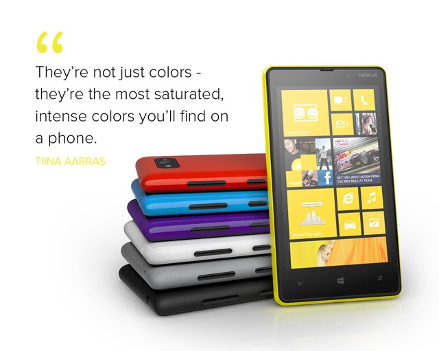
Kun värit sidotaan taidokkaasti tuotteen tarinaan, kertoen kuinka tuote on koostettu, miten värit sitoutuvat materiaalivalintoihin ja digitaalisuuteen, koko tuotekokemusta nostetaan. Nokia kertoi runollisesti N9 ja Lumia 900 värinkehityksestä, jossa he etsivät voimakkainta ja puhtaimpia sävyjä tukemaan muotokieltä. ‘Nämä eivät ole vain värejä – ne ovat kaikkein saturoituneimpia, voimakkaimpia värejä mitä löydät puhelimista,’ sanoo Tiina Aarras, Nokian väri- ja materiaalisuunnittelija. Myös HTC puhuu värin kuratoimisesta 8S ja 8X malleissaan. Huomiota on kiinnitetty myös saumattomaan käyttökokemukseen tuotteen värin ja digitaalisen, Windows 8n välillä.
Väri on vahvasti sidoksissa materiaalivalintaan ja muotoon. Tämä lähestymistapa määrittää väriä, jolloin se ei ole muodin virtojen johdateltavissa. Näin on mahdollista luoda brändille erityisiä värejä, jotka erottavat tuotteet massasta, eivätkä ole ennustettavissa. Piraattimarkkinoilla materiaaliteknologioiden ja värien monimutkaisuus vaikeuttaa tuotteiden kopiointia.
Kuvat Nokia.